The Sound of Change
Sonification of Climate Data
The Sound of change
I started thinking a lot in the spring of 2016 about how much we depend on our eyes when interpreting data, and what kinds of biases that could introduce into our understanding of it.
One of my main questions is what kinds of simplifications we ended up doing because we primarily interpreted it visually. Our eyes and ears, for example are good at doing different things - our senses have a much higher sampling rate with sound than visual (30 frames a second video fools us, but we have to create sounds at up to 22,000Hz to exhaust our ability to hear). Sound slips by us, making it much more difficult to compare and contrast different information delivered this way.
Of course, I'm not a psychologist, so I didn't try creating a double-blind lab experiment. I recruited a few other CT friends and started making an art project using weather data from the National Oceanic and Atmospheric Administration Global Historical Climatology Network (NOAA GHCN) archive.
We didn't finish the project. But it was a very useful exploration in building a practical understanding of useful parameter mapping, particularly in an audio context.
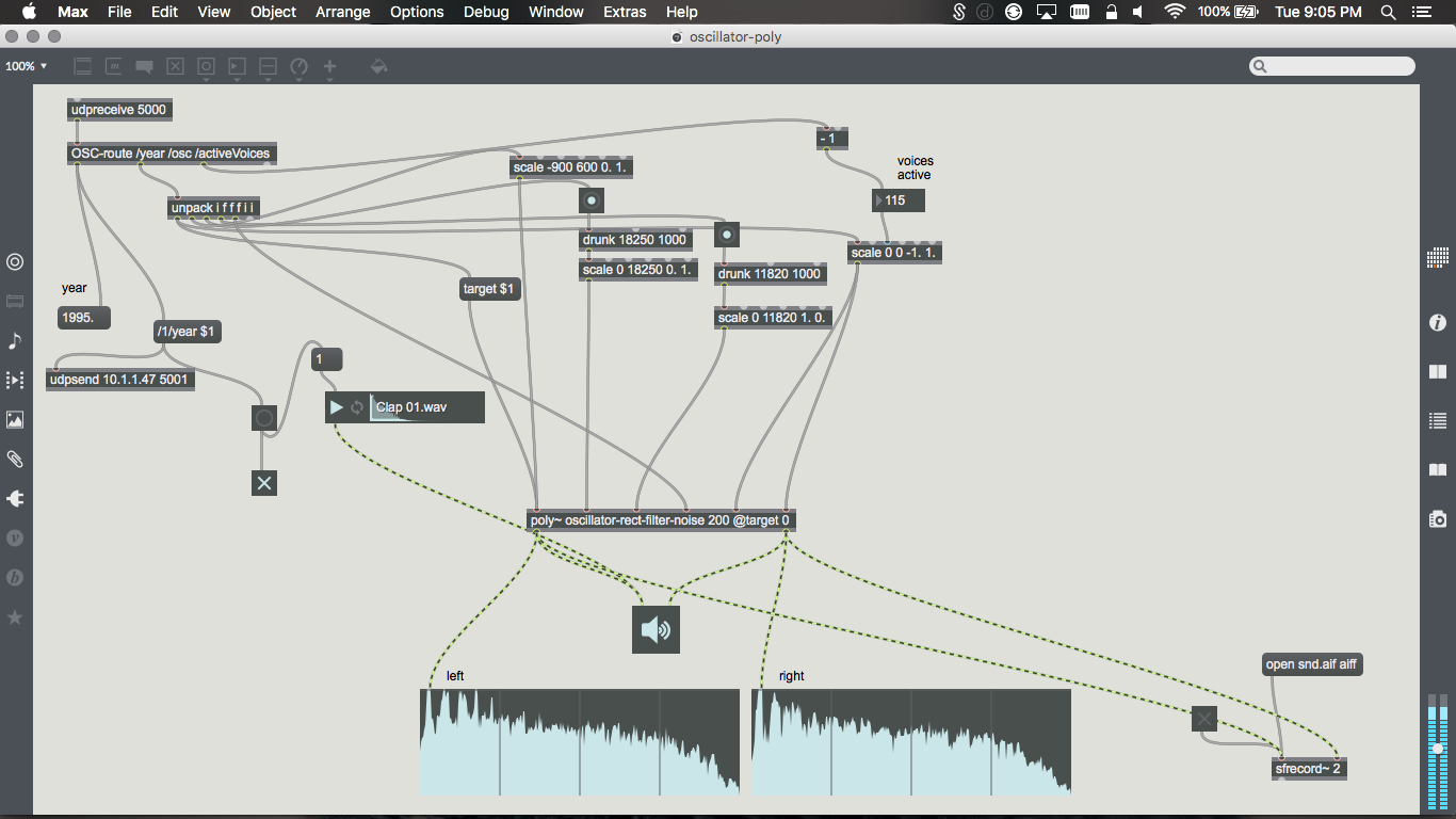
As you listen to the following test, which is relying on data from the 1850s and using a granular sythesis technique to mangle an audio clip, along with some drums sync'd to the changing year, you'll notice it's really easy to hear when you encounter outlying or extreme data points, even without knowing anything about how the parameters are mapped or what granular synthesis even is.
From a user's perspective, sonification may be faster to scan information, but users don't get fine-grained information about the data from it unless they're going to deal with extremely small datasets. In fact, to run the complete NOAA GHCN dataset we used through the sonifier would result in half an hour of audio to review.